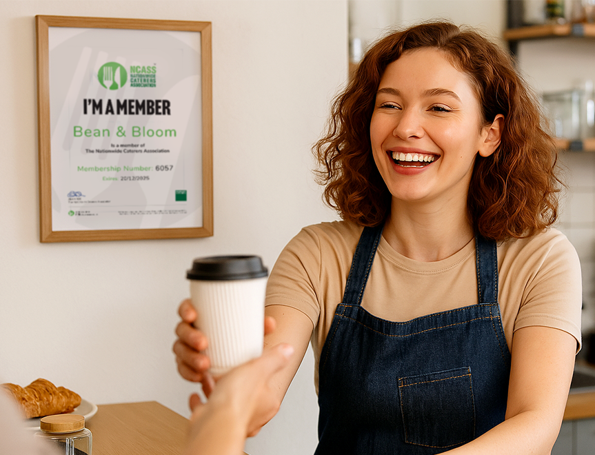
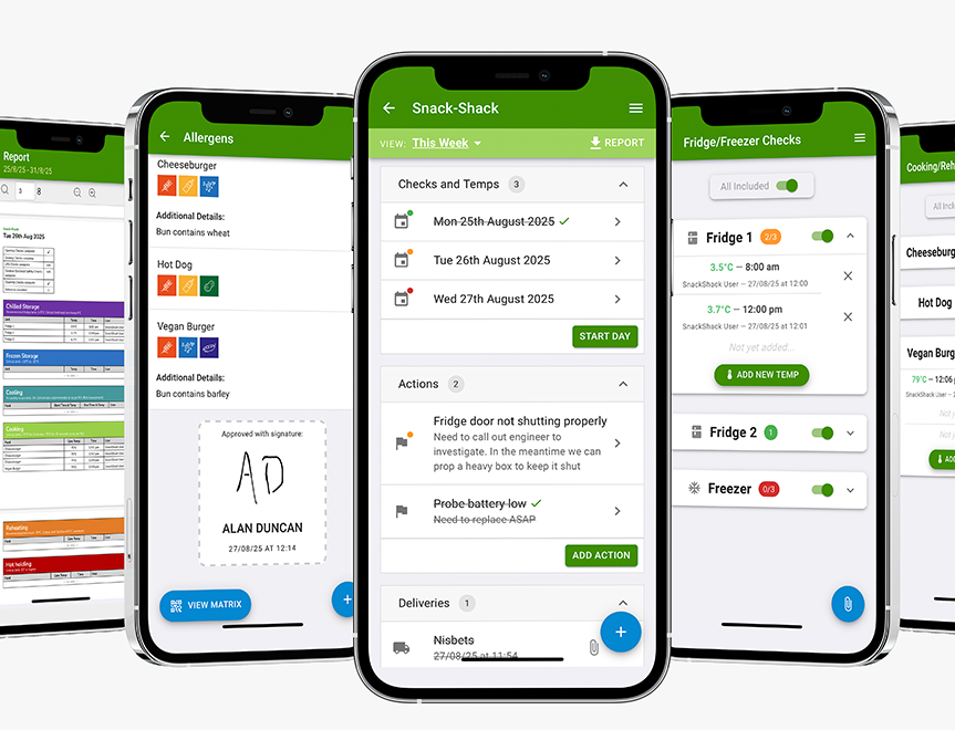
Digital Food Safety System
Save time, reduce hassle and keep your business inspection-ready.

If someone landed on your website and gave it five seconds of attention, would they know what kind of food you serve? Would they click off the website feeling hungrier?
Five seconds is often all the time you get to transform someone from a casual browser into a paying customer.
Most customers don’t arrive on your homepage ready to read. They’re comparing options, usually on their phone, maybe on the way into town, maybe deciding where to book tonight. If your homepage doesn’t click straight away, they’re gone.
The good news is that passing the 5-second test doesn’t require a full website rebuild. A few smart tweaks can work a treat.
Let’s take a look at the areas in which you can improve.
Want more simple, proven ideas to help you get found locally, attract more customers, and turn first-time visitors into regulars?
It’s simple.
Show your homepage to someone for five seconds, then ask:
If the answers are hesitant, unclear or “err…maybe?”, your homepage isn’t doing its job.
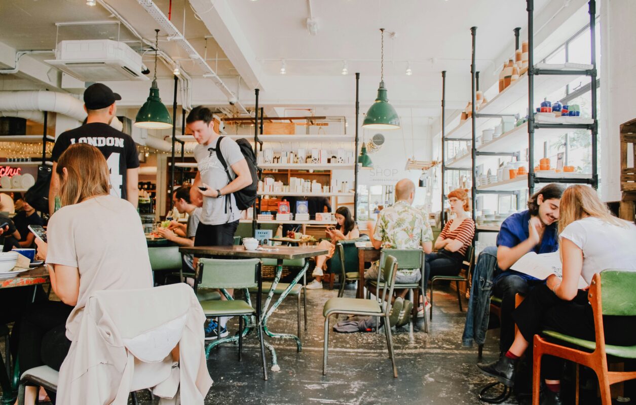
These days, your homepage is often your first impression.
It’s where people land from:
And unlike walking past your venue, they can’t smell the food, see the plates going out or hear the buzz. Your homepage has to provide all of that emotion, and fast.
Budgets are tight and customers are looking for reassurance, clarity and a reason to treat themselves. People don’t have the same disposable income they enjoyed a few years ago, and they need to know that their hard-earned money is being spent on somewhere they won’t regret finding.
This is the biggest one.
If your homepage opens with:
“Welcome to our family-run independent venue in the heart of…”
You’ve already lost precious seconds.
Instead, show people the good stuff first:
For example:
Proper pub food, done well
Slow-cooked roasts, seasonal specials and cracking puddings – all made fresh in-house.
That tells people exactly why they should keep scrolling.
Is this a:
Don’t make people guess.
A single line can do the job:
Clarity builds confidence. Confidence leads to bookings.
Just like your menu, your homepage copy should do some appetite-building.
A few well-placed words go a long way:
You don’t need a paragraph. One or two phrases near the top can change how the whole page feels.
If your homepage sounds more like an ‘About page’ than a food page, it’s time for a tweak.
People scan websites the same way they scan menus – quickly and a bit chaotically.
Make it easy by:
If someone has to hunt for the menu, you’re making life harder than it needs to be.
This one gets overlooked all the time and it is probably one of – if not THE – most important step.
Open your homepage on your phone and ask:
If the answer is “not really”, that’s where to focus first. Most customers won’t forgive a clunky mobile experience, they’ll just move on to the next business.
Grab a brew and run through this:
Small changes here often deliver big results.
Your homepage doesn’t need to say everything.
It just needs to make people feel something – namely appetite, curiosity and confidence – quickly.
If your food is good (and we’re betting it is!), your website should back it up. A few tweaks, a clearer message, and a bit more focus on the food can turn casual browsers into booked tables.
It’s a simple plan that will make all the difference.
Need more hands-on support with your marketing?
At NCASS, we work with thousands of bars, cafés and restaurants across the UK. From getting found online to expert guidance when you need it, we’re here to help your business thrive. Call us on 0300 124 6866 to chat.

 Featured Training