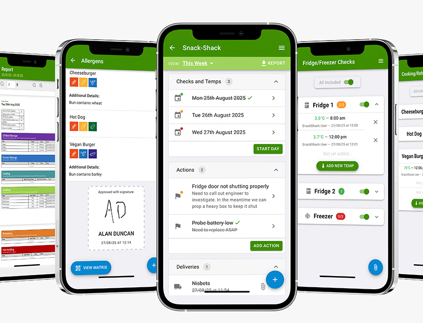
Digital Food Safety System
Save time, reduce hassle and keep your business inspection-ready.

For many hospitality businesses, a website is often the first interaction a potential customer has with your venue.
Before they see your food, experience your service or walk through your doors, they’ve already formed an opinion based on what they find online.
The challenge is that most restaurant, pub and café websites aren’t designed to convert visitors into customers. They may look great, but if guests can’t quickly find what they’re looking for, understand what makes your venue special or book a table with ease, they’ll simply move on to a competitor.
The good news is that improving your website doesn’t necessarily require a complete redesign. Often, small changes to your content, layout and customer journey can have a significant impact on enquiries, bookings and revenue.
This guide has been created specifically for independent restaurants, pubs and cafés that want to make their website work harder. Whether you’re reviewing your current site or planning improvements, the following sections will help you identify opportunities to attract more customers and convert more visitors into paying guests.
This guide walks through the essential foundations every hospitality business needs to get more bookings:
Thinking of starting a business? Answer a few questions that will help us support you and others in your position going forward.
Whether they’re browsing your website, finding you through Google, comparing venues nearby or deciding where to book for dinner, your menu helps shape that decision. Well-written menu descriptions can build confidence, create anticipation and encourage customers to choose your venue over a competitor.
Rather than simply listing what’s on the plate, help customers imagine the dish before they arrive. For example:
Basic description:
Beef burger with cheese and chips
Stronger description:
Aged Herefordshire beef burger topped with mature cheddar, fresh salad and smoky BBQ sauce, served with chunky chips or fries.
The second version creates a clearer picture of the meal, highlights quality ingredients and helps justify the price. Customers are more likely to book when they feel confident about what they can expect.
A few carefully chosen words can make dishes more appealing without sounding exaggerated.
Words like these can help bring dishes to life:
✔ Crispy
✔ Creamy
✔ Smoky
✔ Chargrilled
Aim to include:
✔ One or two sensory words
✔ A clear cooking method
✔ One standout ingredient
Avoid overusing phrases like “ultimate”, “loaded” or “next-level”, which can quickly lose their impact.
Most visitors won’t read every menu description in detail, especially on mobile devices.
Make it easy by:
✔ Keeping descriptions concise
✔ Clearly listing key ingredients
✔ Highlighting vegetarian, vegan or spicy dishes
✔ Using clear section headings
✔ Avoiding unnecessary jargon
If a customer can understand a dish instantly, they’re more likely to continue towards making a booking or placing an order.
Independent hospitality businesses often have genuine selling points that larger chains can’t match.
Make sure customers know if dishes are:
✔ Made in-house
✔ Locally sourced
✔ Slow-cooked
✔ Signature recipes
✔ Customer favourites
Simple labels can help build trust and reinforce quality:
✔ Customer Favourite
✔ Locally Sourced
✔ Slow-Cooked for 8 Hours
✔ Signature Dish
The way dishes are presented can influence what customers notice first.
A few simple techniques include:
✔ Giving best-selling dishes slightly more detailed descriptions
✔ Placing popular items near the top of each section
✔ Grouping similar dishes together
✔ Using visual hierarchy to draw attention to key dishes
The goal isn’t to push customers into a decision but to make choosing easier and more enjoyable.
Online menus need to answer questions that customers would normally ask a member of staff.
Where relevant, include:
✔ Portion size information
✔ Side dishes included
✔ Available upgrades or extras
✔ Dietary information
✔ Whether a dish is suited to sharing
The clearer the information, the more confident customers will feel about booking or ordering.
A well-written menu does more than list dishes. It helps customers picture the experience, builds trust in your food and gives them another reason to choose your venue when deciding where to book.
If someone landed on your website and gave it five seconds of attention, would they know what kind of food you serve? Would they click off the website feeling hungrier?
Five seconds is often all the time you get to transform someone from a casual browser into a paying customer.
The good news is that passing the 5-second test doesn’t require a full website rebuild. A few smart tweaks can work a treat.
It’s simple.
Show your homepage to someone for five seconds, then ask:
✔ What does this place serve?
✔ What kind of venue is it?
✔ Would you eat here?
If the answers are hesitant, unclear or “err…maybe?”, your homepage isn’t doing its job.
These days, your homepage is often your first impression.
It’s where people land from:
✔ Google searches
✔ Booking platforms
✔ Social links
✔ Maps apps
And unlike walking past your venue, they can’t smell the food, see the plates going out or hear the buzz. Your homepage has to provide all of that emotion, and fast.
This is the biggest one. If your homepage opens with: “Welcome to our family-run independent venue in the heart of…” You’ve already lost precious seconds.
Show people the good stuff first:
✔ A strong food image
✔ A clear tagline about what you serve
✔ A short, appetising description
For example:
✔ Proper pub food, done well
✔ Slow-cooked roasts, seasonal specials and cracking puddings – all made fresh in-house.
✔ That tells people exactly why they should keep scrolling
Is this a:
✔ Laid-back neighbourhood pub?
✔ Brunch-loving café crowd?
✔ Date-night restaurant?
✔ Family-friendly spot?
✔ Don’t make people guess.
A single line can do the job:
✔ “Relaxed dining, perfect for sharing”
✔ “Brunch, coffee and cheeky cocktails”
✔ “Comfort food and proper pints”
Clarity builds confidence. Confidence leads to bookings.
Just like your menu, your homepage copy should do some appetite-building.
A few well-placed words go a long way:
✔ Freshly baked
✔ Slow-cooked
✔ Crispy
✔ Seasonal
✔ Crafted by hand
You don’t need a paragraph. One or two phrases near the top can change how the whole page feels. If your homepage sounds more like an ‘About page’ than a food page, it’s time for a tweak.
People scan websites the same way they scan menus – quickly and a bit chaotically.
Make it easy by:
✔ Keeping text short and punchy
✔ Breaking things into sections
✔ Putting key info near the top
✔ Using buttons like View Menu or Book a Table early
If someone has to hunt for the menu, you’re making life harder than it needs to be.
This one gets overlooked all the time and it is probably one of – if not THE – most important step.
Open your homepage on your phone and ask:
✔ Can I see food straight away?
✔ Does the headline make sense?
✔ Is it easy to tap the menu or booking button?
✔ Is it scrolling nicely and not cutting out text?
If the answer is “not really”, that’s where to focus first. Most customers won’t forgive a clunky mobile experience, they’ll just move on to the next business.
Your homepage doesn’t need to say everything. It just needs to make people feel something – namely appetite, curiosity and confidence – quickly.
If your food is good (and we’re betting it is!), your website should back it up. A few tweaks, a clearer message, and a bit more focus on the food can turn casual browsers into booked tables.
Subscribe to our mailing list and get weekly insights, resources and articles for free
Your restaurant website isn’t just a digital menu, it’s your most powerful sales tool.
Before a guest ever steps foot in your venue to sample the food, they’ve already formed an opinion based on your website. The question is: does your site turn curious browsers into confirmed bookings?
If your answer isn’t a confident “yes,” these top tips are for you. Below are the must-have elements every restaurant website needs to attract guests, build trust, and drive reservations.
Website visitors are impatient. If they can’t find what they need in seconds, they’ll leave and probably book somewhere else.
At a minimum, your homepage should clearly show:
✔ Restaurant name and concept
✔ Address (with a map link)
✔ Opening hours
✔ Phone number
✔ Reservation or booking button
This information should be visible, with mobile functionality, without the need to do much scrolling. If guests have to dig for your hours or location, you’re losing business.
Pro tip: Pin this info in your header or footer so it’s accessible from every page.
Your website should feel like your restaurant.
A fine-dining venue with white tablecloths shouldn’t have a cluttered, casual website. A lively brunch spot shouldn’t look stiff or corporate. Design communicates your vibe instantly.
Key design essentials:
✔ Clean, modern layout
✔ Easy-to-read fonts
✔ Consistent brand colours
✔ Plenty of clean space
A dated or messy website quietly tells guests: this place might not be great. A polished one builds confidence before they even arrive.
People eat with their eyes first, especially online.
High-quality photos of your food, drinks, and space are non-negotiable. Blurry phone shots or stock images won’t cut it. Your photos should:
✔ Show real dishes from your menu (not AI)
✔ Reflect portion size honestly
✔ Capture atmosphere (day and night)
Pro tip: invest in professional photography. One strong image can do more than a paragraph of text ever could.
Your menu is the most-clicked page on your site. If it’s hard to read, guests won’t bother.
What works best:
✔ Text-based menus (not tiny PDFs)
✔ Clear pricing
✔ Logical sections
✔ Simple descriptions
PDFs can be frustrating on phones and hurt your SEO because Google can’t scan it. If you must use a PDF, offer a clean mobile version too.
Pro tip: highlight signature dishes or popular items to guide decision-making.
Don’t assume visitors know what step to take next. Tell them.
Every restaurant website should have clear calls to action like:
✔ Book a Table
✔ Order Online
✔ View Menu
✔ Join Our Mailing List
Your reservation button should stand out visually and appear multiple times, especially on the homepage and menu pages. If bookings matter to your business, they should be impossible to miss.
If guests want to book, don’t slow them down, your reservation system should be:
✔ Easy to use
✔ Mobile-friendly
✔ Fast (no unnecessary steps)
✔ Integrated directly into your site
Every extra click increases the chance they’ll abandon the process. Fewer steps = more confirmed tables.
People trust people. Before choosing a restaurant, guests want reassurance that others love it.
Include:
✔ Google or Yelp reviews
✔ Press mentions
✔ Awards or recognitions
✔ Testimonials
Pro tip: “As seen in…” section or a rotating review quote can significantly boost credibility.
Most restaurant searches happen on phones. If your site doesn’t work perfectly on mobile, you’re losing customers daily.
Check that:
✔ Text is readable without zooming
✔ Buttons are easy to tap
✔ Menus load quickly
✔ Booking works smoothly
✔ A mobile-first experience is no longer a bonus, it’s the baseline.
A slow website kills conversions. If your site takes more than a few seconds to load, visitors will leave. Heavy images, outdated plugins, and bloated designs are common culprits.
Speed matters because:
✔ Guests stay longer
✔ Google ranks you higher
✔ Bookings increase
✔ Simple, streamlined websites almost always outperform flashy but slow ones.
Guests love a story, but only if it’s authentic and concise.
You could share:
✔ Why you started
✔ What makes your food special
✔ Your philosophy or passion
This human touch creates emotional connection and helps guests feel good about choosing you. Just don’t bury the important stuff under a novel.
When it’s clear, fast, beautiful, and easy to use, it works around the clock, answering questions, building trust, and filling tables while you focus on running your restaurant.
If your site isn’t doing that yet, it’s not just a design issue, it’s a revenue opportunity waiting to be unlocked.
We're here to help make your catering business a success. Whether that be starting up or getting on top of your compliance and marketing. We're here to help you succeed.
Find out more Request a call back

 Featured Training